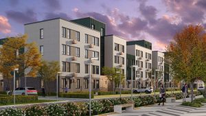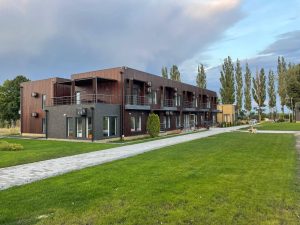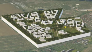
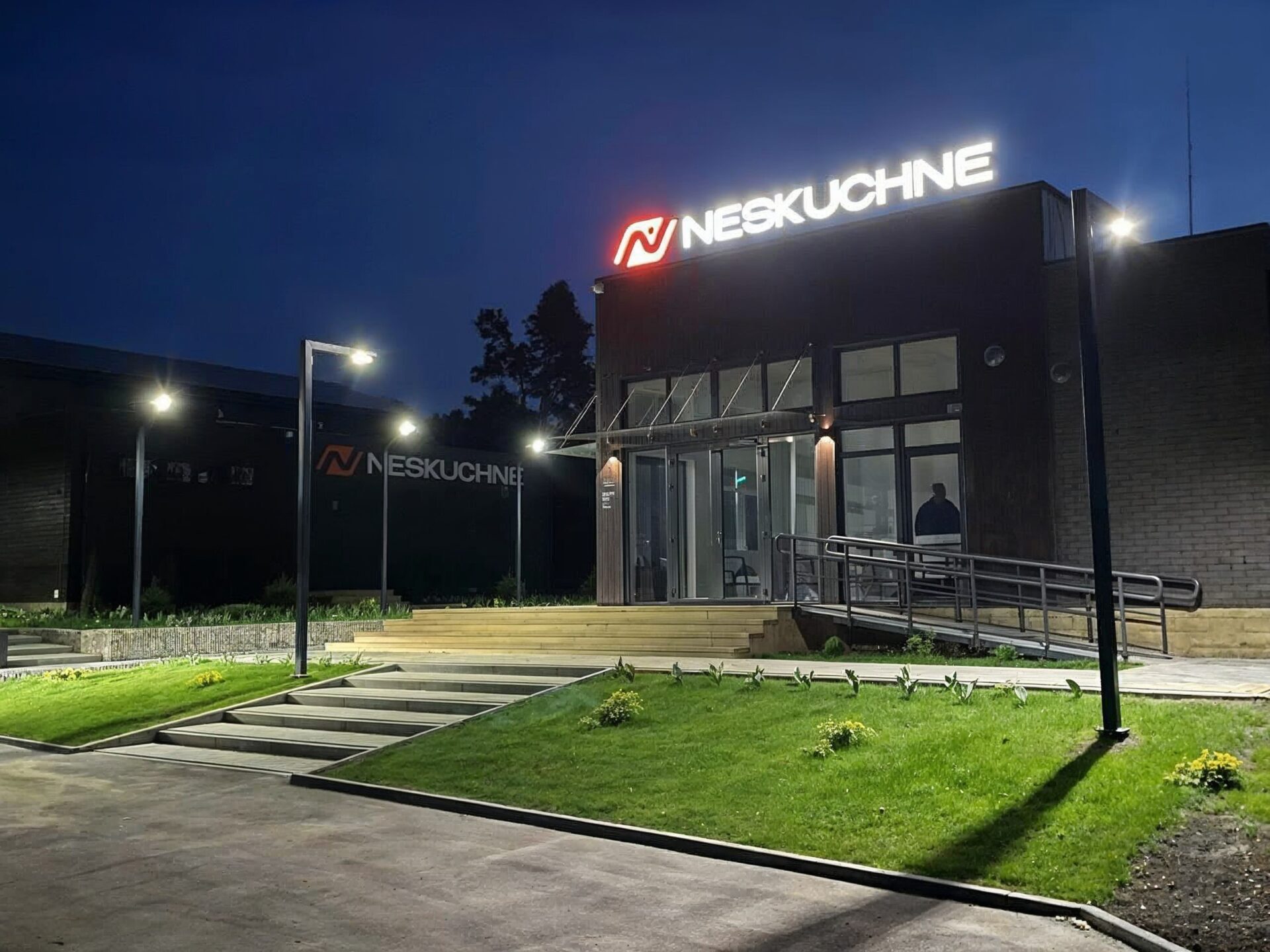
Neskuchne has a long history. In the 1980s, the base worked as a training center for skiers and biathletes in the winter, and when the snow melted, as a children’s camp. But since the mid-1990s, the economic crisis has practically stopped funding for sports. The base has fallen into disrepair, the buildings have become empty, and over time, activities have completely ceased. In the 2010s, the first attempts to restore Neskuchne began. There was an idea to create a modern multifunctional sports and recreation center, and Czech specialists were involved in the project. The created architectural solution provided for holding international tournaments and competitions.
“Neskuchne” is reborn
In 2024, the project received a new lease of life – and a new mission. Today, “Neskuchne” is not only about sports. It is also a space for physical and psychological rehabilitation. The local nature creates ideal conditions: forest trails, lakes, hills – everything inspires recovery and unity with oneself. Hiking trails, water activities, professional rehabilitation specialists – everything to find strength in oneself.

Logo
The Neskuchne brand visually conveys the main idea – the path to oneself. The logo is built from curved lines that resemble a path. They symbolize the individual path to recovery – the one that everyone goes through at their own pace. These lines form a figure with raised arms – an image of triumph, inner strength, the moment when “I could”. Our main color – warm orange – conveys the idea of energy, warmth, movement.

Corporate identity
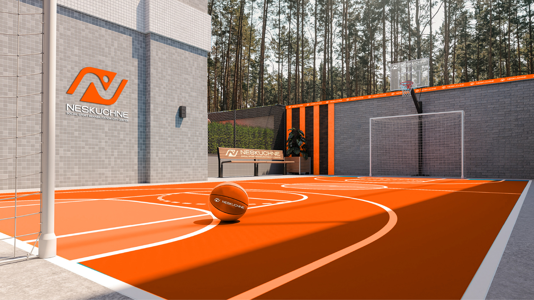
Creative Agency “Chokolad” have deeply worked out the visual language of the brand in the context of the space in which it lives:
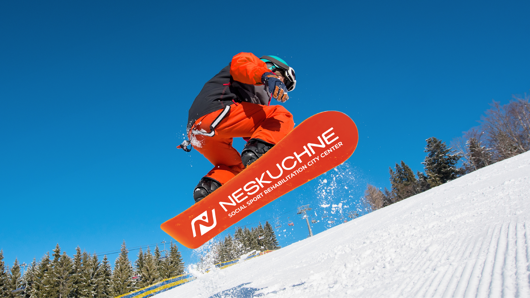
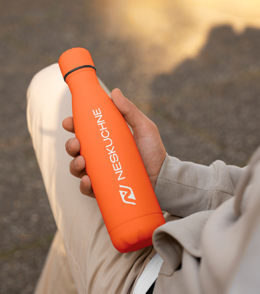
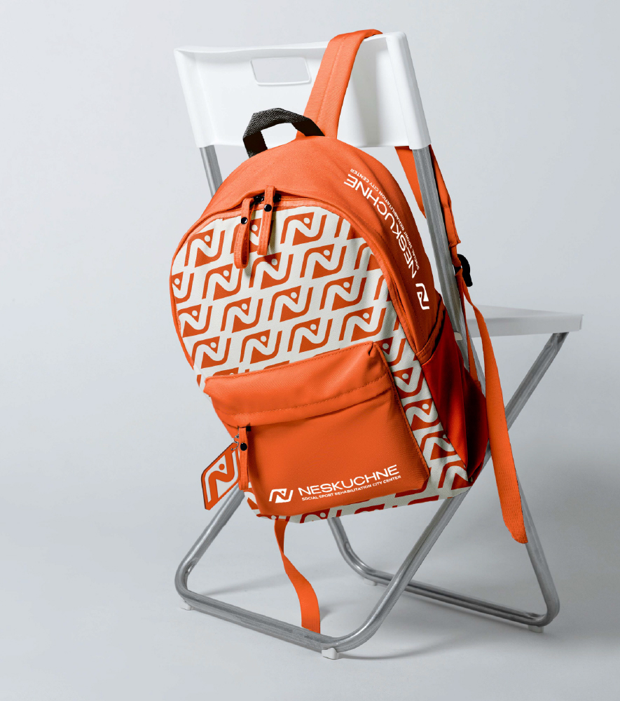
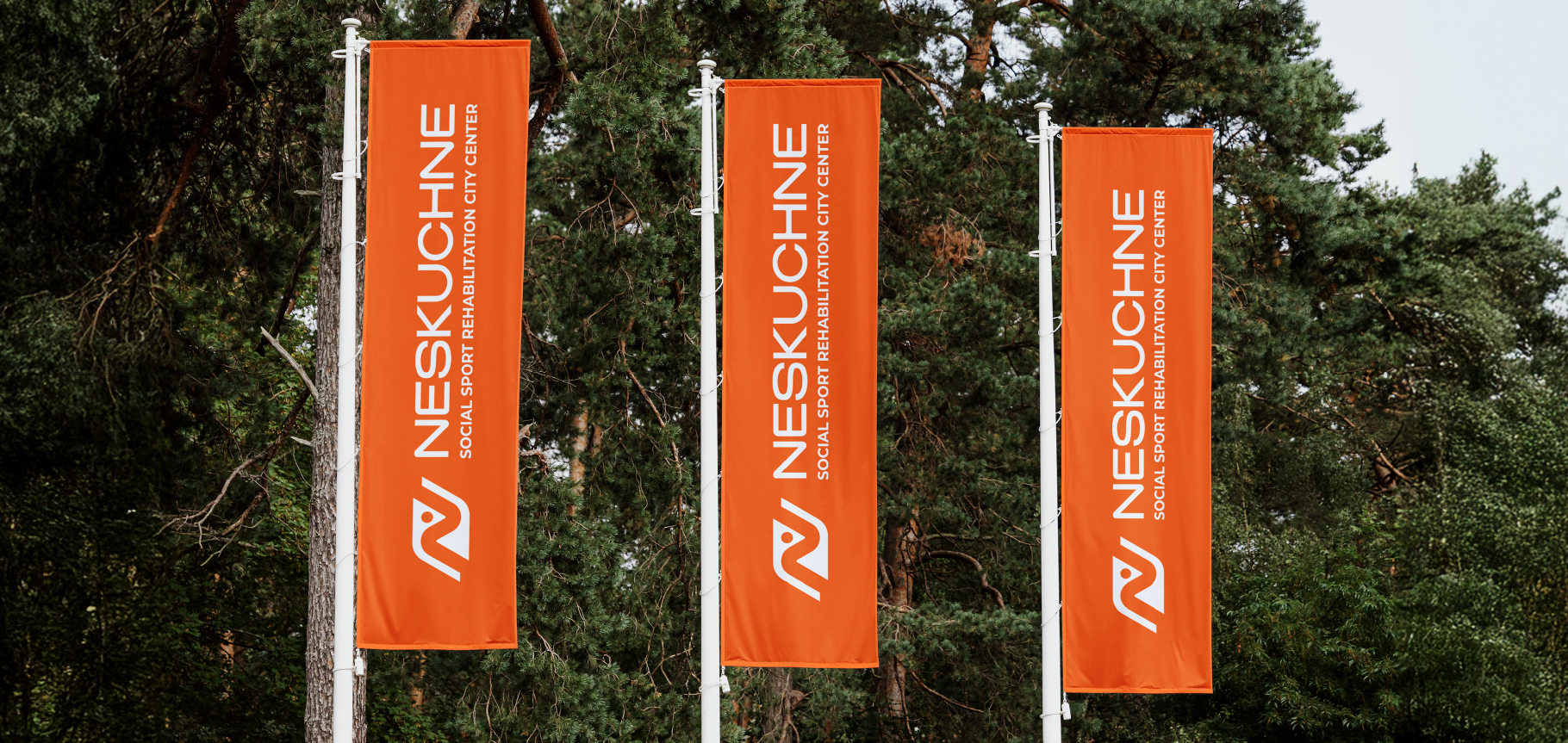
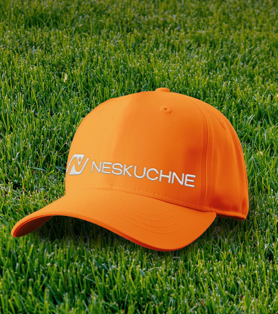
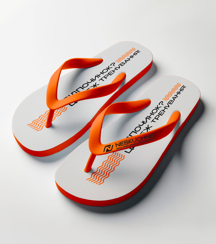
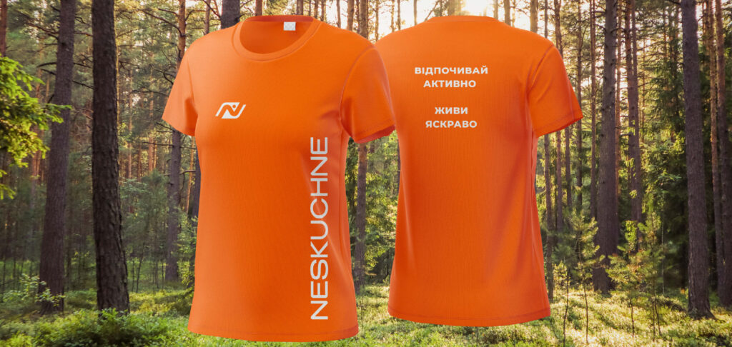
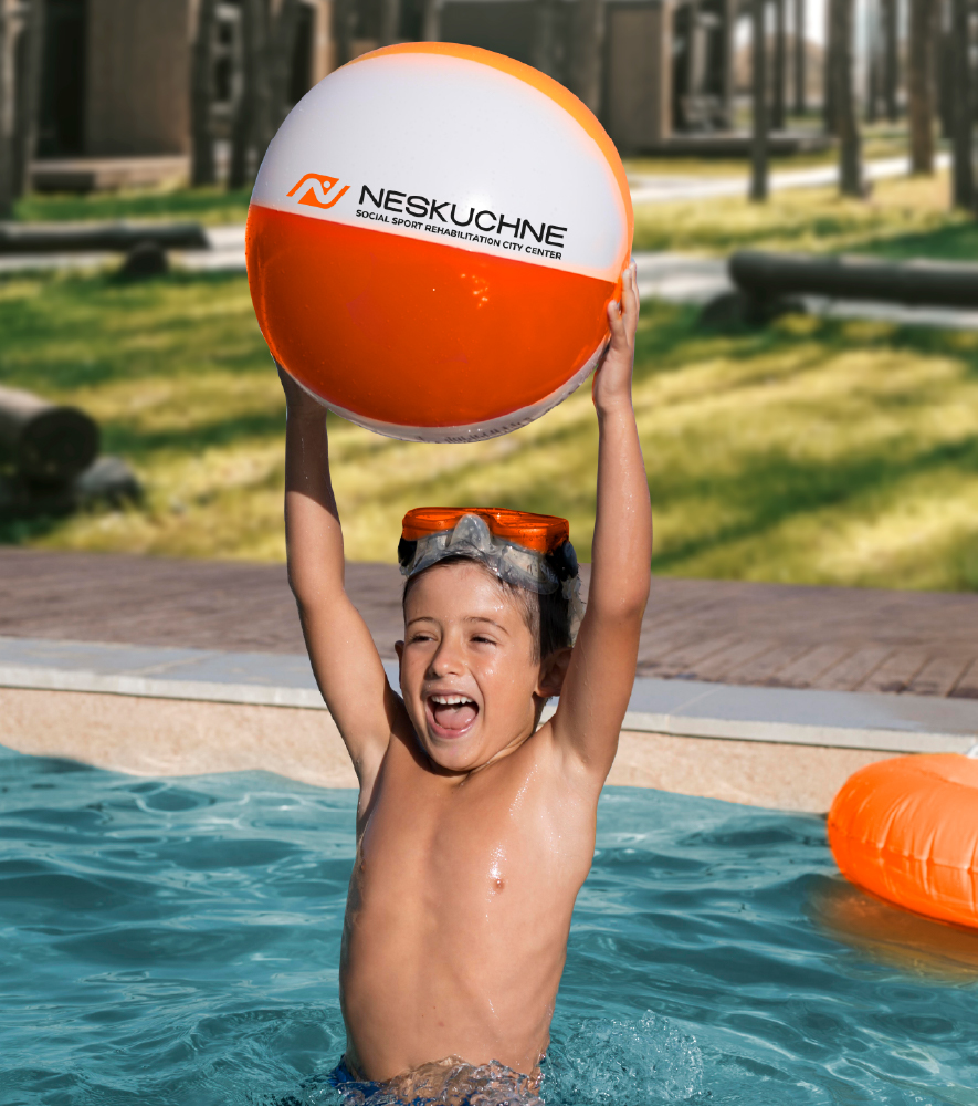
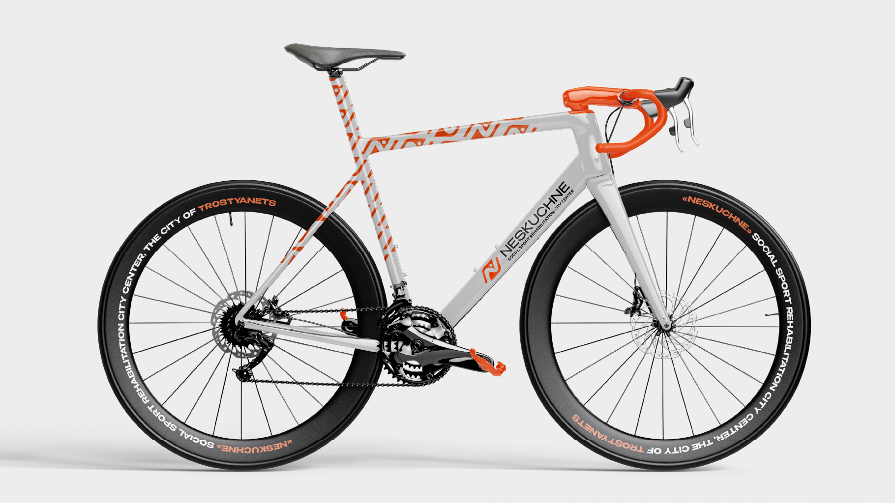
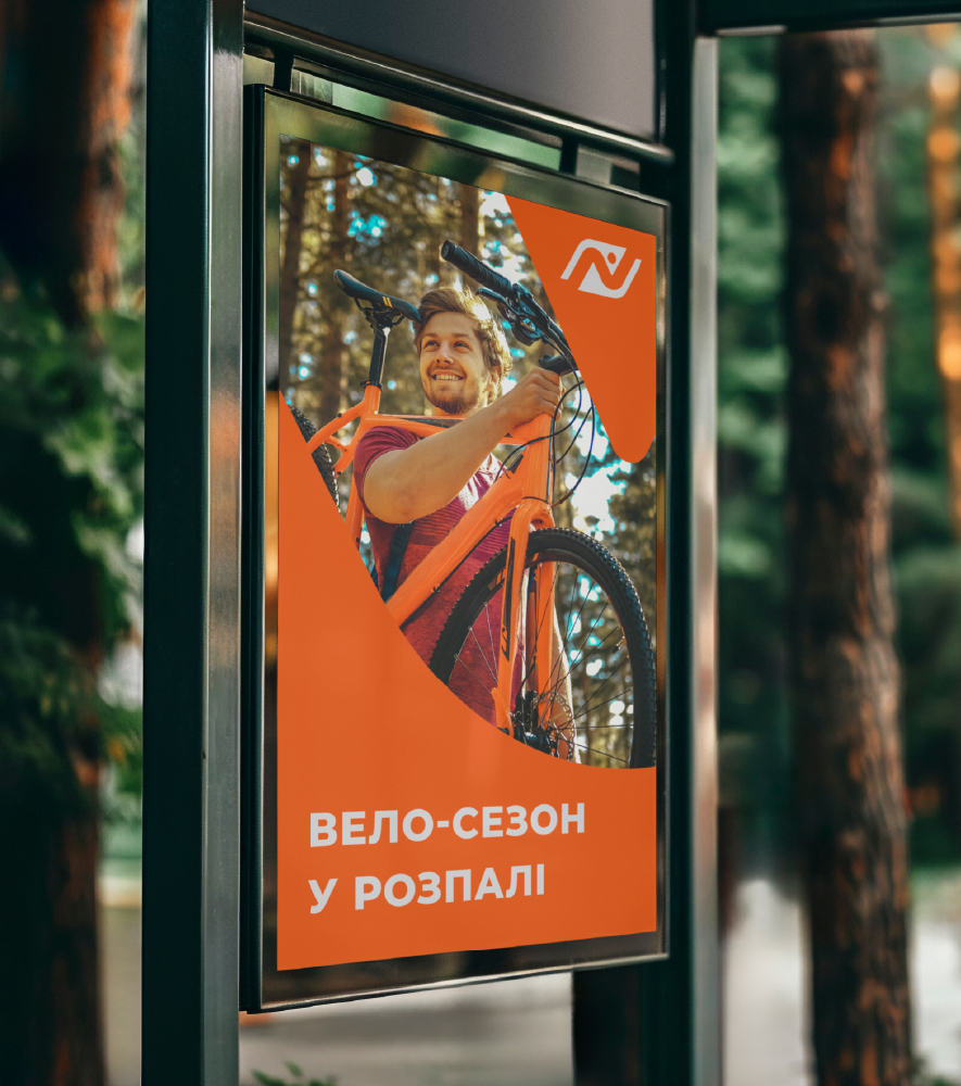
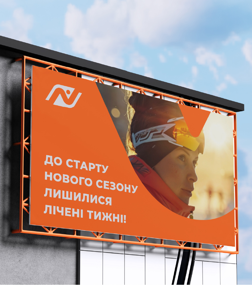
- created the media: form, printing, souvenir products;
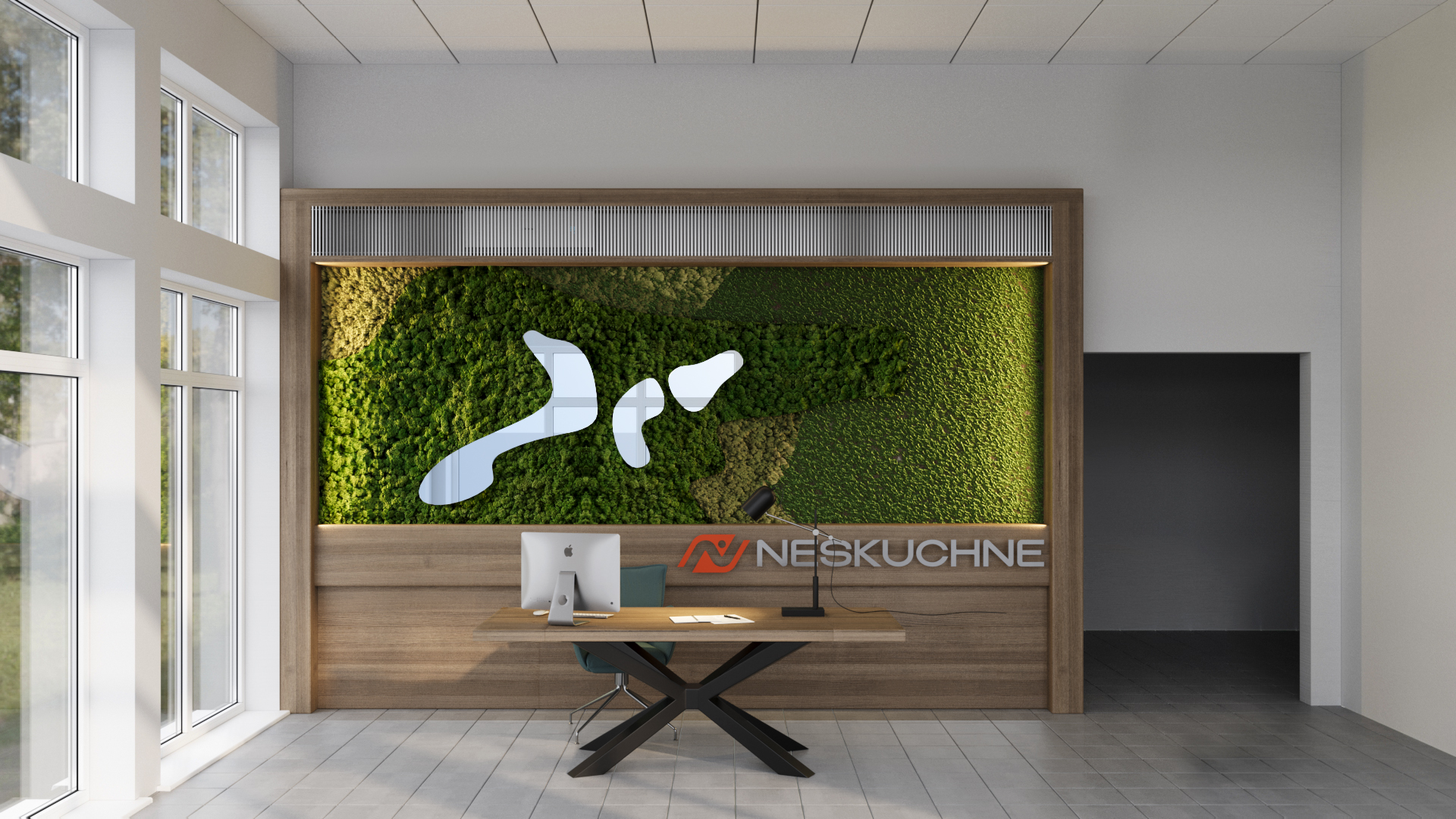
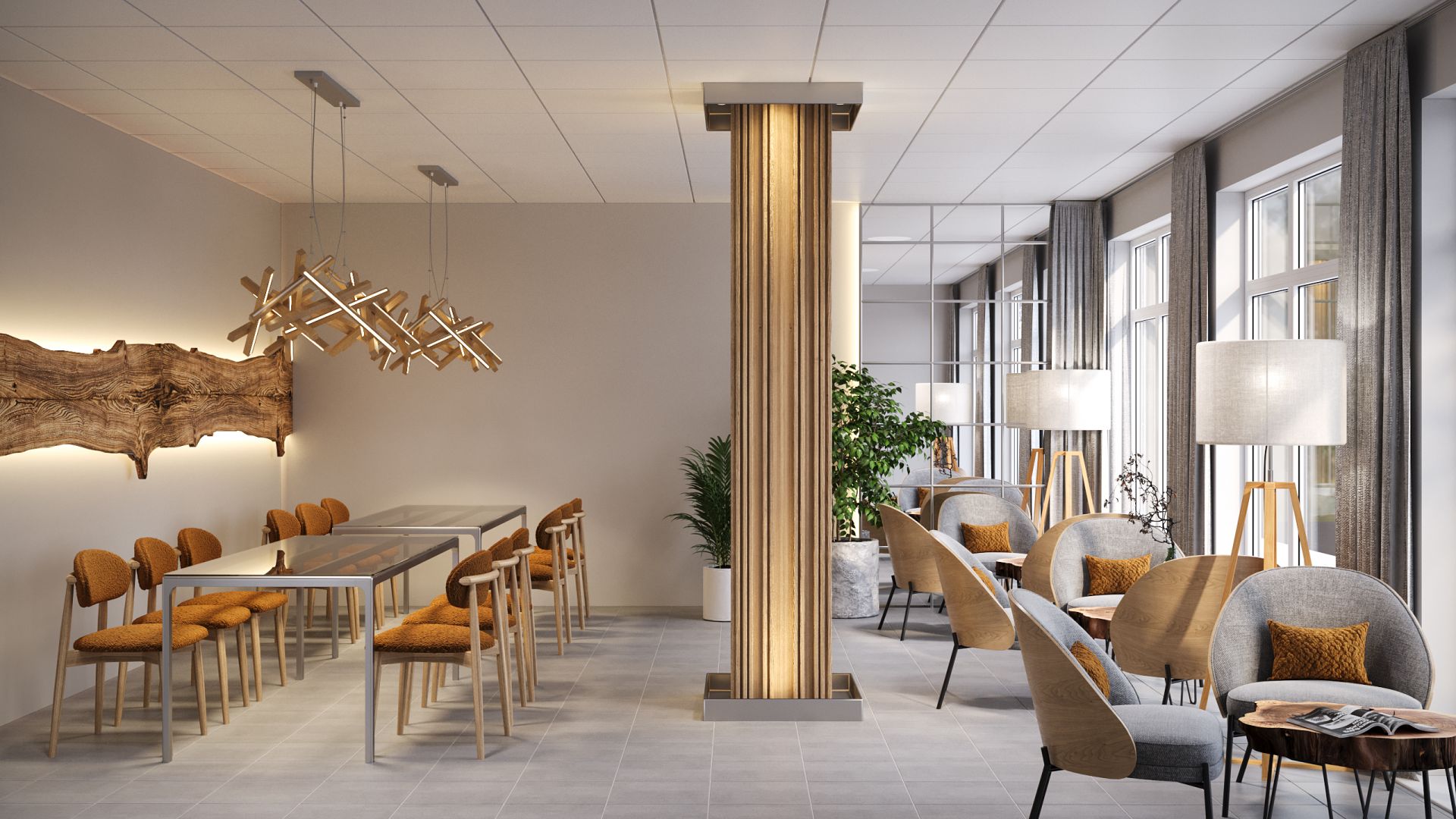
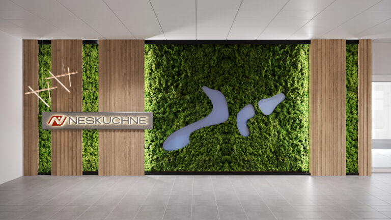
- designed the interior of common spaces – dining rooms, receptions, lounge areas;
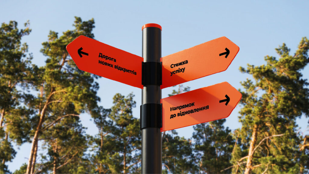
- developed the principles of internal navigation